Metrics
Regression
Absolute error distribution when plotted: should be symmetric, bell-shaped, centered around 0 with some occasional outliers. Residuals plot should have no patterns.
See other under regression cost functions.
Classification
Accuracy = (TP + TN) / (TP + TN + FP + FN)
Precision = TP / (TP + FP) – how often clf correct when predicting positive
Recall = TP / (TP + FN) – how often clf correct for all positive instances (aka sensitivity, aka TPR (True Positive Rate)
F-beta score
 β is the weight of recall (gives more importance to precision if β < 1)
Specificity, TNR (true negative rate) = TN / (TN + FP)
FPR(False Positive Rate) = 1 - Specificity = FP / (TN + FP)
Prediction bias = "average prediction" – "average observations". Ideally should be 0, and a significant nonzero prediction bias => bug in the model because the model is wrong about how frequently positive labels occur
AUC (ROC curve)
https://developers.google.com/machine-learning/crash-course/classification/roc-and-auc
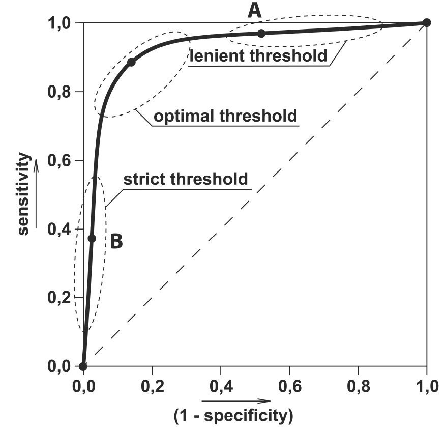
An ROC curve (receiver operating characteristic curve) shows the performance of a classifier at all classification thresholds by plotting the True Positive Rate TPR (sensitivity) vs. False Positive Rate FPR (1-specificity)
The greater the AUC (the area under the ROC curve) , the better is the performance of the model at different thresholds between positive and negative classes:
AUC = 1 => classifier perfectly distinguishes between Positive and Negative classes
AUC = 0.5 => classifier is not able to distinguish between Positive and Negative classes.
AUC = 0 => predicts all Negatives as Positives and vice versa
Lowering the classification threshold classifies more items as positive, thus increasing both False Positives and True Positives. The following figure shows a typical ROC curve.
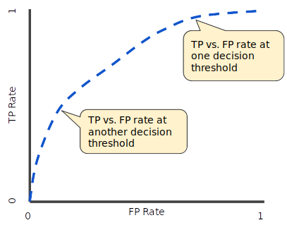
Figure 4. TP vs. FP rate at different classification thresholds.
To compute the points in an ROC curve, we could evaluate a logistic regression model many times with different classification thresholds, but this would be inefficient. Fortunately, there's an efficient, sorting-based algorithm that can provide this information for us, called AUC.
AUC: Area Under the ROC Curve
AUC stands for "Area under the ROC Curve." That is, AUC measures the entire two-dimensional area underneath the entire ROC curve (think integral calculus) from (0,0) to (1,1).
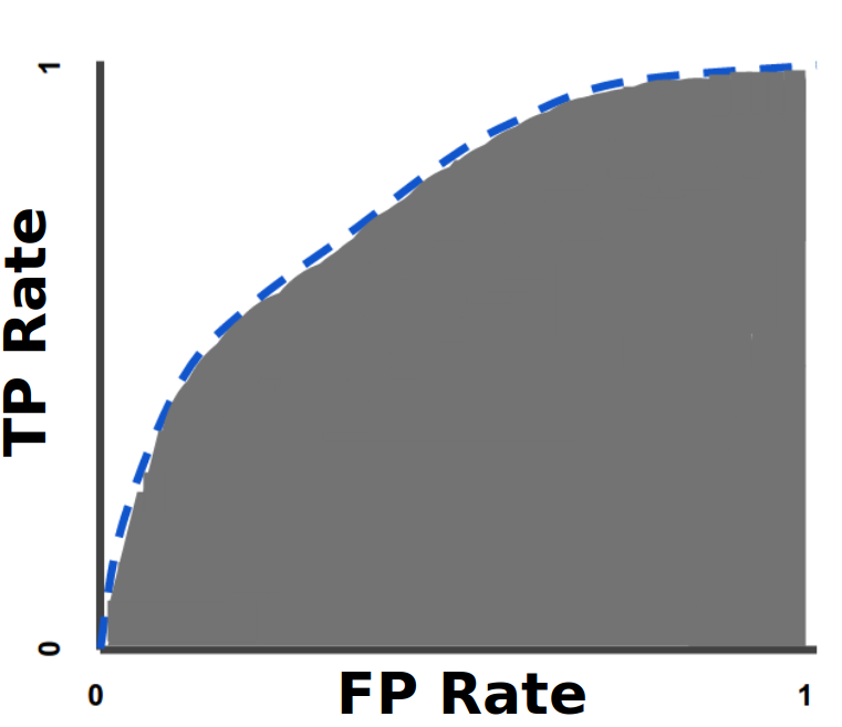
Figure 5. AUC (Area under the ROC Curve).
AUC provides an aggregate measure of performance across all possible classification thresholds. One way of interpreting AUC is as the probability that the model ranks a random positive example more highly than a random negative example. For example, given the following examples, which are arranged from left to right in ascending order of logistic regression predictions:

Figure 6. Predictions ranked in ascending order of logistic regression score.
AUC represents the probability that a random positive (green) example is positioned to the right of a random negative (red) example.
AUC ranges in value from 0 to 1. A model whose predictions are 100% wrong has an AUC of 0.0; one whose predictions are 100% correct has an AUC of 1.0.
AUC is desirable for the following two reasons:
AUC is scale-invariant. It measures how well predictions are ranked, rather than their absolute values.
AUC is classification-threshold-invariant. It measures the quality of the model's predictions irrespective of what classification threshold is chosen.
However, both these reasons come with caveats, which may limit the usefulness of AUC in certain use cases:
Scale invariance is not always desirable. For example, sometimes we really do need well calibrated probability outputs, and AUC won’t tell us about that.
Classification-threshold invariance is not always desirable. In cases where there are wide disparities in the cost of false negatives vs. false positives, it may be critical to minimize one type of classification error. For example, when doing email spam detection, you likely want to prioritize minimizing false positives (even if that results in a significant increase of false negatives). AUC isn't a useful metric for this type of optimization
Selecting the threshold with ROC curve: